
Photo by Pixabay
Furniture mixing is no longer a fad but an interior design secret that allows you to express your creativity and personality. However, mismatched furniture and art pieces can result in visual chaos and cluttered spaces when incorrectly done. That is where understanding color theory in interior design becomes essential. Here are the golden color rules to achieve the desired look without a mess.
Stick to a Cohesive Color Palette
The foundational rule in mismatching furniture is to work with a consistent color palette that ties the entire room together. Your home will feel intentional and harmonious when the room’s elements share common hues or undertones. That is true even when the styles, textures, and materials vary. The first step to achieving this is picking two to three primary colors. These include a dominant base, a secondary contrast, and an accent hue for pop.
For example, you can choose navy blue as a base and warm wood tone as a secondary. For accents, choose brass or mustard yellow. However, always allocate 60% to base, color, 30% to the secondary, and 10% to accent hues. This creates a balanced distribution, especially when mixing different furniture styles. You can also repeat color tones differently, such as varying dominant and secondary tones in each room.
Balance Warm and Cool Tones
Color patterns and temperatures can add visual interest to your space when mixing furniture. But it can also break your goals and make the room look messy if you do not balance them carefully. Hence, even with a unified palette, mixing warm and cool tones is crucial to make the space feel dynamic. This starts with picking one color temperature as dominant and introducing the other as an accent. For example, you can choose red, orange, or warm wood stains like cherry as dominant. For cool tones, go for blue, greens, or slate.
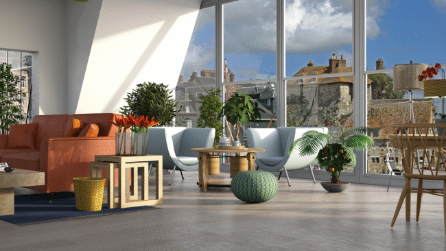
Earth tones can help you bridge the gaps between warm and cool tones. For example, taupe, olive, or greige can significantly unify different color temperatures in the same space. You can also experiment with neutrals as anchors to create a sense of calm and structure in your home. For instance, large beige sofas with yellow undertones may not pair well with bluish-grey armchairs unless there is a neutral or bridging tone to connect them.
Repeat Colors Across the Room
Repeat is a powerful color principle in interior design. When you professionally repeat colors across your space, even dramatically mixed furniture design and styles can feel like they belong together. The secret establishes rhythm and unity in eclectic interiors. You can repeat colors across the room using different furniture types, accessories, finishes, and hardware. For instance, you can choose one standout color and intentionally repeat it in other parts of the room.
Color triangulation is another visual technique that creates balance and movement across the space. This involves placing the same color in three points throughout the room to form a triangle. You should repeat the same with curtains, throw pillows, and other bookshelves to reinforce your chosen hues. However, avoid using the same shade or item too often, as it can make the space look staged.
Endnote
Mismatching furniture is a fun way to create a collected and personal room. However, it can easily become messy if you lack a solid understanding of basic color rules. By sticking to the above golden rules, you can master the art of mixing furniture and creating a home that looks curated.