
The best staging professionals in New York do not simply decorate homes—they curate environments that drive emotional connection and purchasing decisions. Among their most effective and timeless tools is using neutral color palettes. From luxury condos in Manhattan to brownstones in Brooklyn, neutral tones dominate the strategy of the top names in home staging New York. There is a practical reason behind this trend; understanding it can offer valuable insights to sellers and real estate agents alike.
This blog explores why the most trusted experts in luxury real estate staging consistently lean on neutral tones and how these choices help properties sell faster and at higher prices.
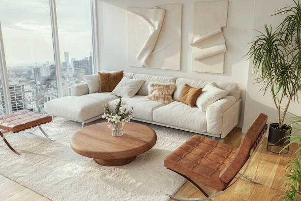
The psychology of neutral tones
Color plays a subtle yet powerful role in how buyers perceive a space. Neutral palettes—including whites, greys, beiges, and soft earth tones—create a calming atmosphere that appeals to a broader audience. Unlike bold or trendy colors that may alienate some buyers, neutral shades allow visitors to project their tastes and lifestyles onto the space.
Top professionals in home staging New York know buyers are not just looking for four walls and a roof. They are visualizing a future. Neutral tones make that vision easier to build. These colors reduce distraction, promote harmony, and highlight architectural details—resulting in a more sophisticated presentation overall.
Enhancing spatial perception
Another reason neutral palettes are essential in luxury real estate staging is their ability to enhance how space is perceived. Lighter neutrals make rooms appear larger, brighter, and more open. They also effectively reflect natural light, which is especially useful in compact city apartments or units with limited sunlight.
Experienced stagers understand that perception is everything. Potential buyers are more likely to value a space that feels expansive. Neutral color schemes allow furnishings, textures, and finishes to shine without overwhelming the senses.
Universality boosts marketability
New York City features an exceptionally diverse real estate market, which calls for a design approach that resonates with a wide range of demographics and lifestyle preferences. Neutral palettes are versatile and universally appealing, whether the buyer is a young professional, a growing family, or an international investor.
Stagers specializing in home staging New York often select neutral tones as a foundational element. These tones create a blank canvas that works well with various design styles, from modern minimalist to classic elegance. As a result, the property’s potential resonates with a much broader audience.
Supporting luxury through subtlety
In high-end real estate, every design decision must reinforce a sense of elegance and value. Bold colors or dramatic patterns can easily clash with luxurious finishes, expensive furnishings, or high-end materials. On the other hand, neutrals elevate the space by allowing these features to remain the focal point.
Professionals focused on luxury real estate staging use neutral palettes to enhance premium aesthetics. They understand that understated elegance often speaks louder than flashy design. With soft tones, the space feels curated rather than decorated—a quality that serious buyers notice.
Final thoughts
Neutral palettes are more than just a safe design choice—they are a strategic decision backed by years of real estate insight. From influencing buyer psychology to increasing visual space and universal appeal, neutrals deliver proven results in both presentation and performance.
Unsurprisingly, leaders in home staging New York and luxury real estate staging continue to rely on them. Adopting a neutral palette remains one of the most powerful and practical tools for sellers aiming to position their property for success.